Starting June 28, 2025, small-, medium- and large-sized enterprises must have fully implemented the European Accessibility Act (EAA). From then on, companies will have to meet specific accessibility requirements for their digital products and services. The goal is to make these more inclusive and user-friendly. The EAA has profound implications for mobile app and web developers.
In this article, we’ll break down what you need to consider when building an accessible app and how you can align your development with the EAA standards.
The purpose of the European Accessibility Act
Approximately 101 million people in Europe, or one in four adults, have some form of disability. For this group, access to basic products and services is often limited or non-existent. The European Accessibility Act aims to change that. It is designed to improve accessibility across a broad range of physical and digital products and services, including websites and mobile apps.
The EEA’s goal is to support all individuals with functional limitations, including those with physical, mental, intellectual, sensory, and age-related impairments, whether temporary or permanent.
Previously governed by national laws, accessibility regulation will now be standardized across Europe. This leads to consumers having wider and more socially inclusive offers on the market at more competitive prices. For businesses, the ability to reach a wider audience creates greater market potential. Furthermore, the unified regulations simplify trade in digital products and services with other European countries.
Who needs to comply with the accessibility standards?
The EAA applies to companies in the digital sector that provide certain products and services, including:
- Digital and electronic devices: computers and operating systems, e-readers and TV equipment
- Telecommunication and audiovisual media services: mobile devices and smartphones, television programs and films
- Self-service and public terminals: payment and self-service machines like ATMs and check-in kiosks, certain aspects of air, bus, rail, and water transport services, including websites, mobile apps, e-tickets, and information
- Financial and commercial services: consumer banking services and e-commerce platforms
Specifically, the EAA applies to all apps sold within the European Union that fall into the categories above. This means that if your app is available on an app store in any European country, even if you’re headquartered outside the EU, you will need to comply with the accessibility standards of the EAA. The only exemption is for companies with fewer than 10 employees.
What are the specific accessibility standards that need to be met?
The EAA outlines general accessibility principles to follow, rather than specifying detailed technical solutions on how to implement these principles. It provides a flexible framework that allows for various approaches to meet accessibility goals.
For all information and communications technology, the EAA specifies the established European standard EN 301 549 as the primary guideline. As its technical framework, the EN 301 549 includes the Web Content Accessibility Guidelines (WCAG) developed by the W3C.
The WCAG covers four key principles, also known as the POUR principles:
- Perceivable: Users should be able to perceive information and user interface components through various means. An example is providing text descriptions for multimedia content, which enables users with visual impairments to access the content through screen readers.
- Operable: Users should be able to interact with the interface using various methods. Voice command is a great example of interface control without physical input.
- Understandable: Users should be able to easily navigate the interface and instructions should be clear. A consistent layout throughout the application or website enables users to predict where to find information.
- Robust: Content must be designed to be compatible with a wide range of assistive technologies and remain accessible as technology evolves.
Where to begin
If your app is already live, and you’re unsure whether it fully complies with the EAA, conducting an accessibility audit is highly recommended. For mobile apps, tools like Android’s Accessibility Scanner and iOS’s Accessibility Inspector can help pinpoint areas for improvement.
While they are a good starting point, automated tools should be complemented with hands-on user testing. Actually using assistive technologies is crucial to uncover usability challenges that you might otherwise miss.
We recommend addressing accessibility in stages. You could begin by improving color contrast, adding screen reader labels, and ensuring proper keyboard navigation. Next, move on to refining user feedback systems and testing customization features like text size scaling.
Fortunately, both Android and iOS offer built-in accessibility features.
Leveraging Android’s and iOS’ native accessibility features
Building or adjusting your mobile app or website with accessibility in mind requires attention to both user interface (UI) and user experience (UX) design. Android and iOS both offer built-in accessibility features that are easy to integrate, minimizing the need for custom development.
Here are some concrete recommendations to help you implement the EAA guidelines.
UI recommendations
- Consistent design:
A consistent layout and navigation structure across your app or website helps users locate information and functions. Placing buttons, icons, and other interactive elements in uniform positions on every page minimizes confusion and makes them easier to find.
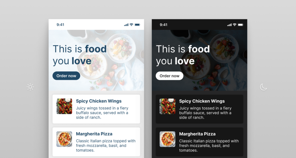
- Dark mode:
While iOS and Android offer system-wide dark mode settings for supported apps and interfaces, embedding dark mode directly into an app can further enhance accessibility. This ensures that dark mode is tailored to the app’s design and functionality, providing a seamless user experience regardless of system settings.
- Color contrast ratio:
For standard use, the contrast ratio between text and background should be at least 4.5:1 for most text. When accessibility mode is enabled, we recommend ensuring a background contrast ratio of 7:1. In Android, the color properties can be defined directly in the layout XML files or programmatically in the app’s code. In iOS, you can adjust it using UIKit or SwiftUI. By offering a high contrast feature, you can improve your content’s readability for users with visual impairments.
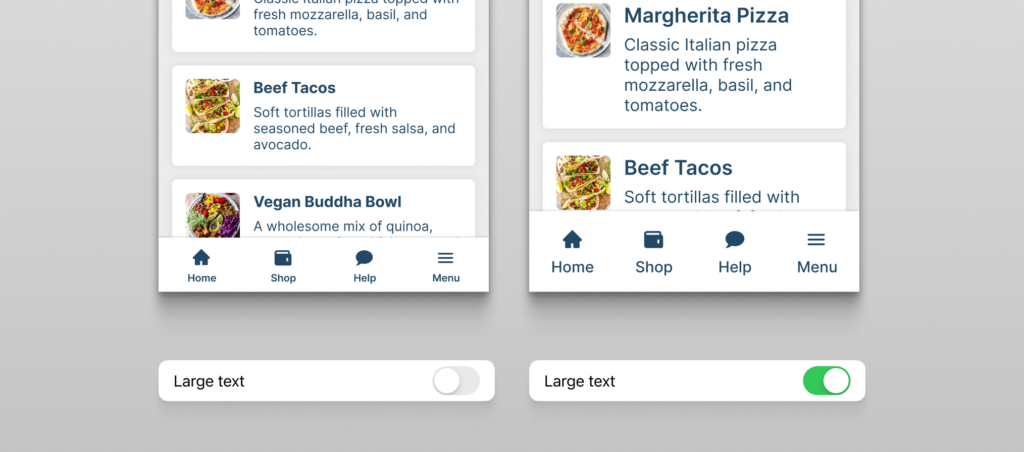
- Readable typography and scalable text:
Use highly legible fonts, and let users adjust the text size without it disrupting the interface layout. While most devices offer a built-in magnifier that uniformly enlarges the screen in fixed units (pixels), dynamic text sizing can provide a better user experience, though it is a more development-intensive solution. Through the use of relative units (like em or rem), text can be scaled proportionally according to the user’s preferences without affecting other design elements.
UX recommendations
- Various navigation methods:
Your interface should be navigable in different ways. Users may rely on keyboards due to physical disabilities that make using touchscreens difficult, while others might use voice commands for hands-free interaction. Some rely on assistive technologies, such as screen readers or adaptive keyboards, to interact with digital content. By accommodating different input methods, you can provide a smoother and more inclusive user experience.
For users who rely on keyboard navigation, integrating keyboard shortcuts helps them easily navigate through your app. It’s important to also offer clear explanations of what each shortcut does, either through an accessibility menu or tooltips.
- Accessibility labels for interactive elements:
Accessibility labels are crucial for interactive elements like buttons, links, and icons. They offer descriptive information that assistive technologies use to communicate the purpose of the element, as screen readers do for users with visual impairments. A trash can icon – for deleting an item – will be overlooked by a screen reader if it lacks a text description label.
In Android, accessibility labels can be added using the contentDescription attribute. In iOS, use the accessibilityLabel property.
- Multimedia content alternatives:
For audio and video content, subtitles, captions, or transcripts should be available. This enhances accessibility for people both with hearing and with visual impairments. Screen readers can then access the content, enabling users to engage with multimedia content via text-to-speech tools like VoiceOver (iOS) and TalkBack (Android). If an image or video includes text, provide an accessibility label that can be accessed by a screen reader.
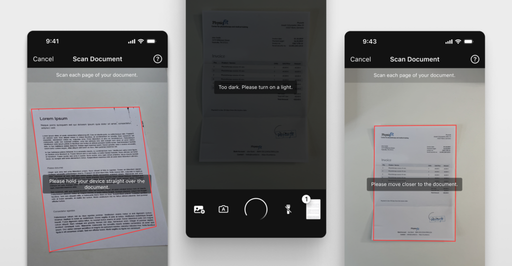
- Supportive feedback with error messages and recovery:
Error messages and recovery mechanisms are essential for user guidance. They help the user understand what the issue is and how to correct it. This reduces confusion and frustration, and improves their overall user experience.
Real-time form validation is a prime example of this principle. It provides users with immediate feedback as they fill out a form, instead of flagging issues only after they try to submit it. If a user enters an invalid email address or leaves a required field blank, the system can instantly highlight the error and offer guidance on how to correct it.
To implement real-time validation logic in Android, add TextWatcher to your form fields. For iOS, add a target for text changes using the addTarget method on UITextField or similar input fields.
- Auditory feedback and alerts:
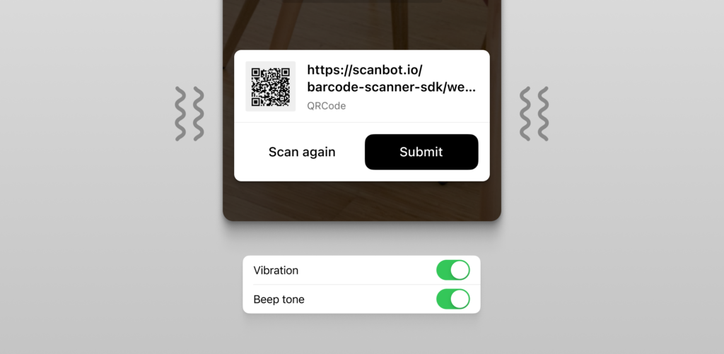
Auditory feedback for actions like button clicks or form submissions is critical for people with visual impairments. A common best practice is to use distinct sounds for different events. This helps users quickly identify the nature of the alert or notification. We also recommend providing haptic feedback (vibration) alongside sound to enhance the experience for all users.
Conversely, you should combine auditory alerts with visual indicators such as pop-ups, banners, or icons. This helps ensure that users who may not hear the sound can still perceive the notification.
- Touchscreen gestures:
Support for common touchscreen gestures, such as swiping and pinching, enhances the experience for users with motor impairments on mobile devices. For instance, a swipe can replace button taps, and pinch-to-zoom allows users to adjust content size without navigating through menus.
Both Android and iOS offer built-in accessibility tools – Android’s Accessibility Menu and iOS’s AssistiveTouch – providing alternative input methods to further improve usability.
Publishing an accessibility statement
In some countries, companies subject to the EAA are required to publish an accessibility statement that includes:
- Details on the product or service’s functionality
- Documentation of technical accessibility specifications and design processes
- A description of compliance with EAA accessibility standards
- Contact information for authorities where users can submit accessibility complaints
Additionally, certain products must meet specific requirements for accessibility-related information, packaging, and labeling. To find out exactly what each country requires, we recommend checking national authorities.
While the EAA standards might seem to call for major changes, many accessibility features are already provided by operating systems like Android and iOS. However, it is crucial that your app or website fully supports and integrates these built-in tools.
We recommend starting by assessing your current accessibility level, and gradually implementing additional features. Thorough real-life usability testing is crucial for this. After all, the EAA is more than a list of boxes to tick, but paves the way for a better user experience for everyone.
