Our journey so far
Scanbot SDK began its life in 2011, when we set out to revolutionize document management. We then pivoted to document scanning in 2014 with our consumer app “Scanbot”, driven by a desire to innovate and deliver the highest scan quality possible.
In 2017, we introduced our B2B scanning solution, the Scanbot SDK. This marked a new chapter in our story, one that saw us shift to cater to the needs of businesses. The response was overwhelmingly positive. This motivated us to focus exclusively on the B2B market from 2020 onwards.
As our CEO Christoph Wagner puts it: “The strategic shift from B2C to B2B allowed us to concentrate on high-quality, reliable solutions for businesses. The new brand design reflects that transition and the growth we have experienced over the last five years.”
Expanding our offerings
Building on the momentum of the Document Scanner SDK, we introduced the Barcode Scanner SDK and Data Capture SDK shortly after. These solutions, too, were quickly adopted by businesses in a variety of industries, further solidifying our position in the B2B space.
Today, we are proud to count many industry-leading companies among our customers, including DocuSign, Deutsche Bahn, Deutsche Telekom, AXA, Generali, Motive, and Rimi Baltic. Their trust is a testament to the quality and reliability of our products.
Embracing change
As we contemplate our journey, we also recognize the need for our brand to evolve. We have grown and matured as a company, and this calls for a refresh of our brand identity. The new design better embodies our focus on enterprise solutions, our values, and our commitment to fast, reliable, and user-friendly software.
“This rebranding is about more than just changing our visual identity. It’s about aligning our brand with our strategic focus and values,” says Christoph Wagner. “We want our brand to clearly communicate the reliability and ease-of-use of our solutions, as well as our dedication to enterprise customers.”
Unveiling our new brand identity
Let’s delve into the details of our new brand design, which includes a new color palette, typeface, and logo.
A fresh coat of paint
Color plays a pivotal role in establishing the visual identity of a brand. It conveys its personality and values and creates a cohesive and consistent visual experience. As Scanbot SDK continues to evolve, we are refreshing our color palette to reflect our growth and the dynamic nature of our brand.

Our primary color remains Cardinal (#C8193C), a vibrant shade of red that symbolizes our passion and energy. Our neutral colors, Black (#000000) and White (#FFFFFF), provide a balanced backdrop for our primary color.
In addition to these, we have introduced five functional colors: Emerald (#55BB77), Saffron (#FFBB33), Portland Orange (#FF5533), Brilliant Azure (#3388FF), and Slate Blue (#6655BB). These colors help communicate important information or actions to our users.
This new color palette creates a more cohesive and accessible visual experience that aligns with our brand’s personality and values.
A typeface that speaks volumes
Typography is a crucial element of a brand’s visual identity and shapes how customers and stakeholders perceive a brand. We felt that it was time to adopt a typeface that better reflects our identity as a B2B solution provider.
That’s why we are transitioning from Fira Sans, a casual typeface, to Inter, a more formal and robust typeface. Inter is a sans-serif font designed for high legibility on screens of all sizes. It conveys professionalism and credibility, aligning perfectly with our business philosophy and goals.

While Fira Sans served us well, Inter brings a new level of sophistication to our brand. Its large x-height, open shapes, and moderate stroke width contribute to its legibility, making it a versatile choice.
Distilling the essence of Scanbot SDK
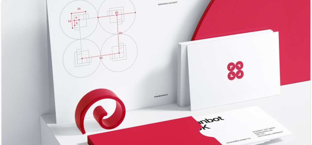
The last piece of our rebranding efforts is our new company logo. It incorporates our main color palette and new font. The design encapsulates what Scanbot SDK is all about: enabling fast and accurate data capture and extraction.
The four circles pick up the signature Scanbot SDK red and contain right angle shapes that together evoke the focus symbol present in a camera viewfinder. They frame the whitespace between the circles, which itself resembles a camera flash. These details immediately communicate our software’s scanning functionalities. The company name, of course, is lettered in the Inter typeface.
The new logo enhances the recognizability of the Scanbot SDK brand and clearly positions our company as a trusted entity in the B2B space.
Moving forward
This rebrand is more than just a visual makeover. It reflects our continual evolution and our commitment to a first-class user experience. We are excited to see this new visual identity bring a fresh perspective to our brand and resonate with our users.
We hope you enjoy our new look as much as we do. Through all changes, we remain dedicated to delivering top-of-the-line solutions and look forward to continuing our journey with you.
Thank you for being a part of the Scanbot SDK story. Here’s to the next chapter!


